ResiCentral
Breaking new ground
“ResiCentral is a wholesale mortgage company that is passionate about their team, customers, and consumers”.
This was the key message that was given to us when we were tasked with creating a new visual identity and website for ResiCentral. The key differentiation for ResiCentral within the mortgage industry was the company’s humanist nature by putting their customers first, which was heavily highlighted within their narrative and brand.


The illustrative style of the logo was approachable, breaking the norm within the current financial markets.
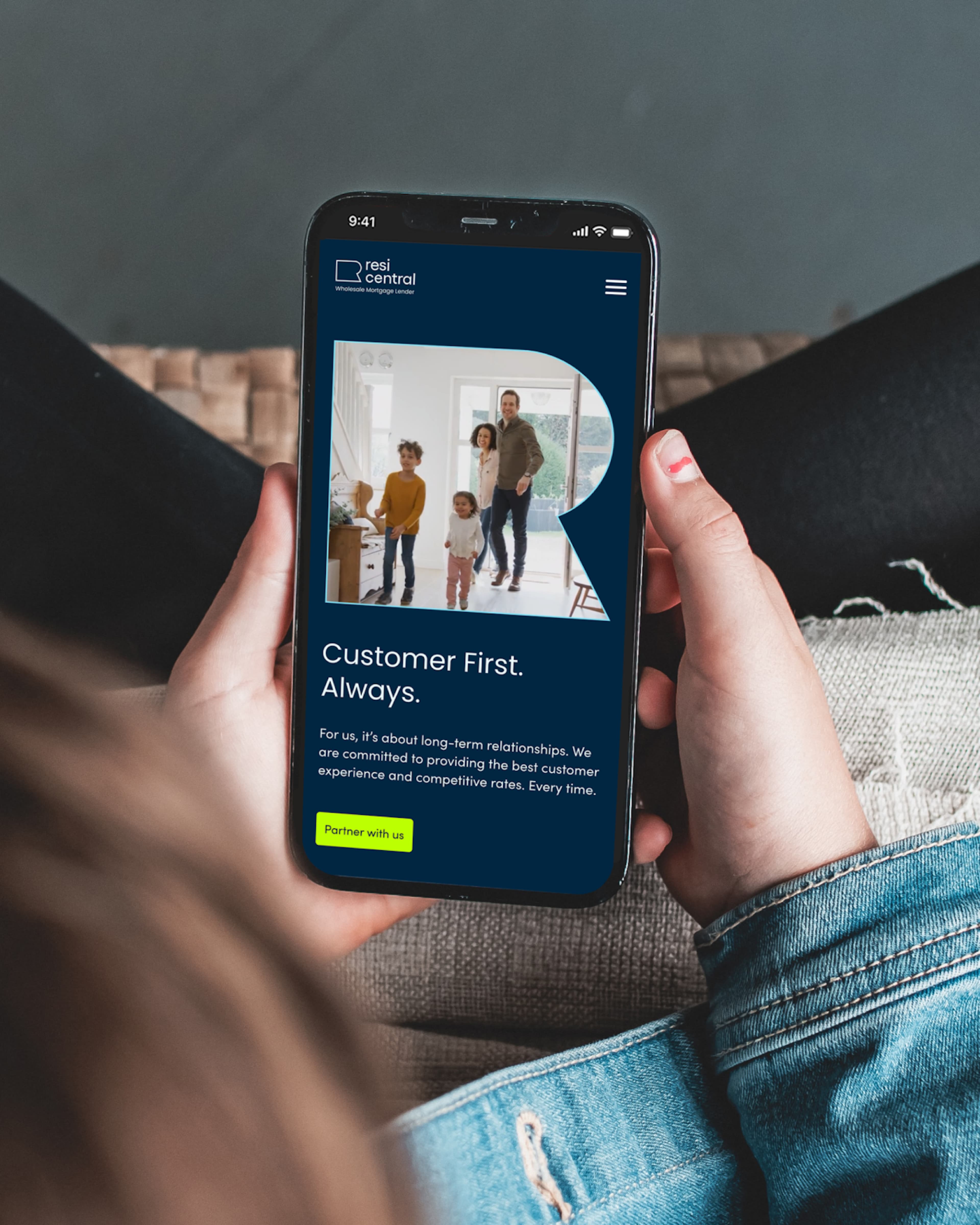
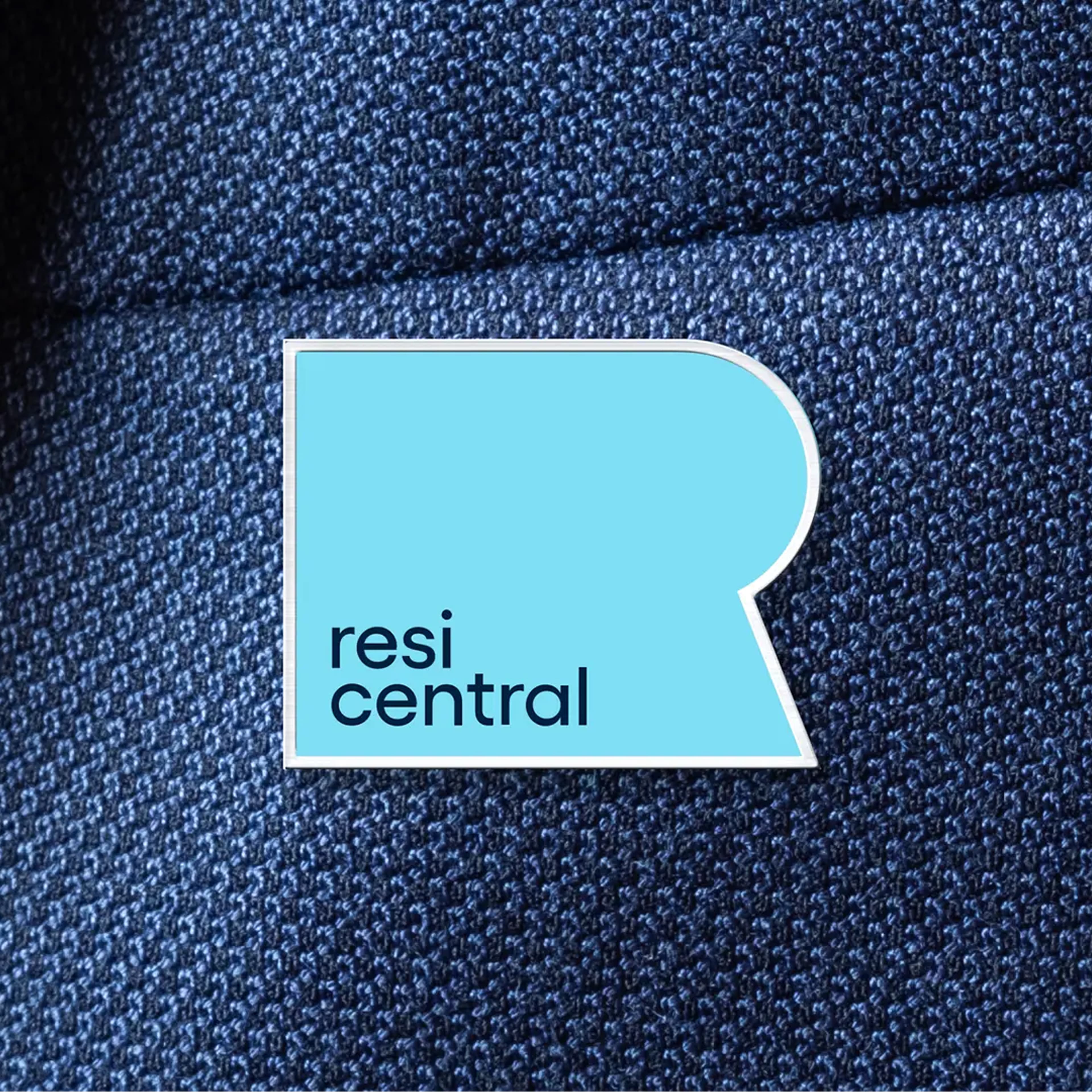
With this design direction in mind we crafted the logo mark to reflect their existing brand but also to be used as a window to frame the true humanist value of the company.
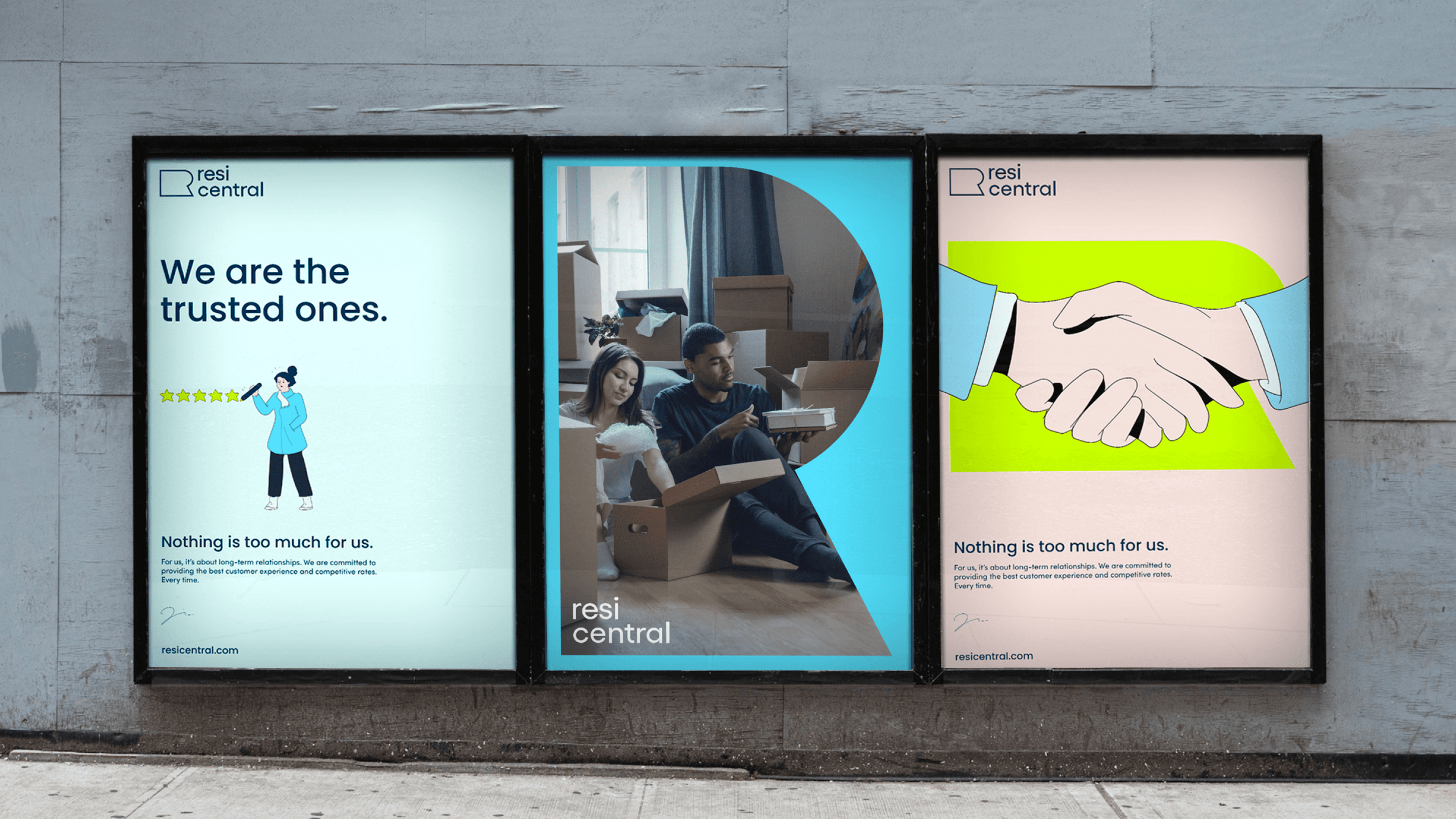
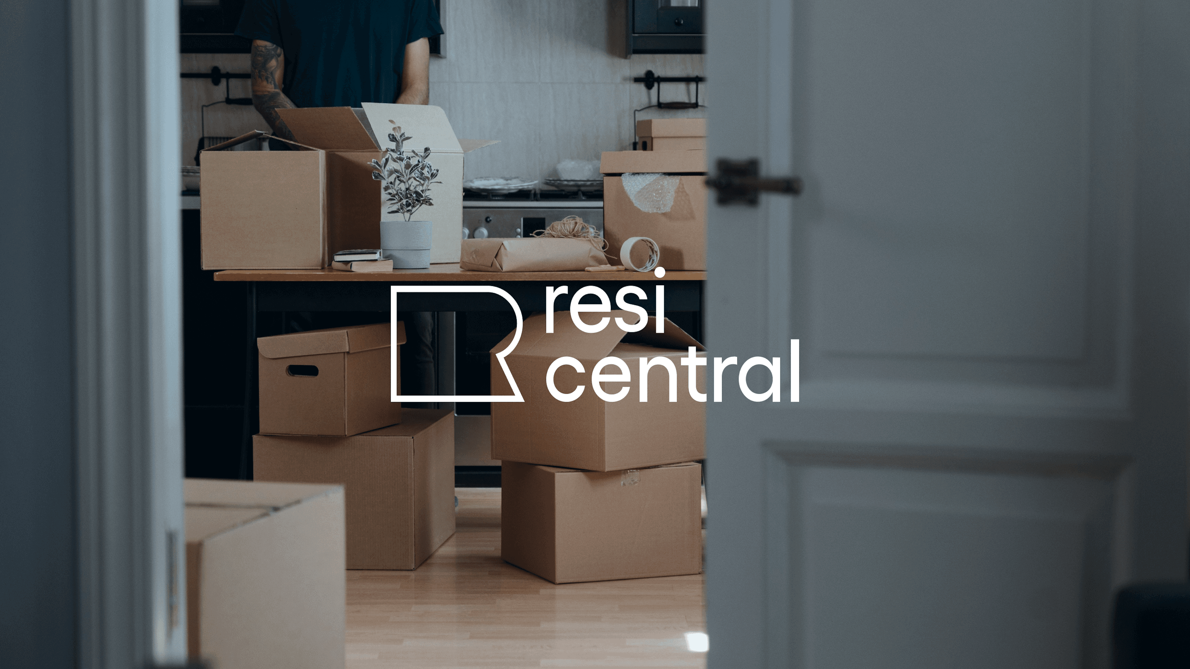
The flexible visual identity focuses on bringing the "R" shape to life, using it as a graphic element or frame central to the brand. Beyond the logo, we developed a comprehensive design system to express the brand's purpose of being open, friendly, and trustworthy. This includes new colors, typefaces, icons, images, clear typography, and engaging illustrations.
Additionally, a new photographic style was created to depict real-life situations, emphasising real people, emotions, and stories. Together, these elements create a fresh and cohesive expression of the ResiCentral brand.