Brightline
Shaping a space for young minds
Brightline acts as your reliable partner in parenting for kids' behavioral or mental health challenges. Whether virtual therapy, psychiatry, or coaching, they bring kids, teens, and families affordable, accessible support across the United States. After partnering with SE to rebuild and maintain their online presence last year, Brightline came to us for an identity and web refresh to embrace a fresh, uplifting, and energetic aesthetic.
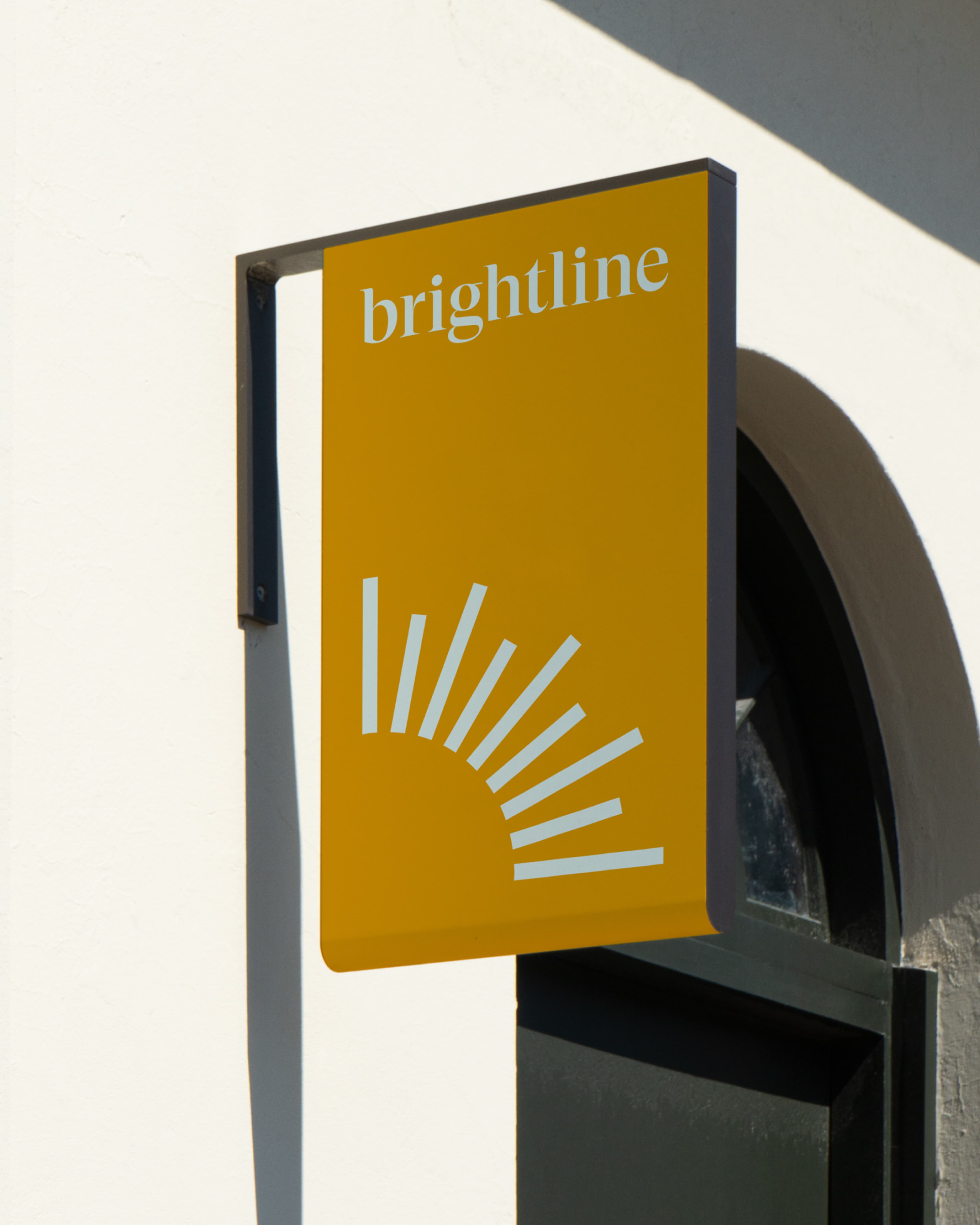
Their renewed look had to radiate positivity and trust in both digital and tactile touchpoints as they opened their first in-person clinics - delivering a seamless experience that feels welcoming, warm and confidently modern.
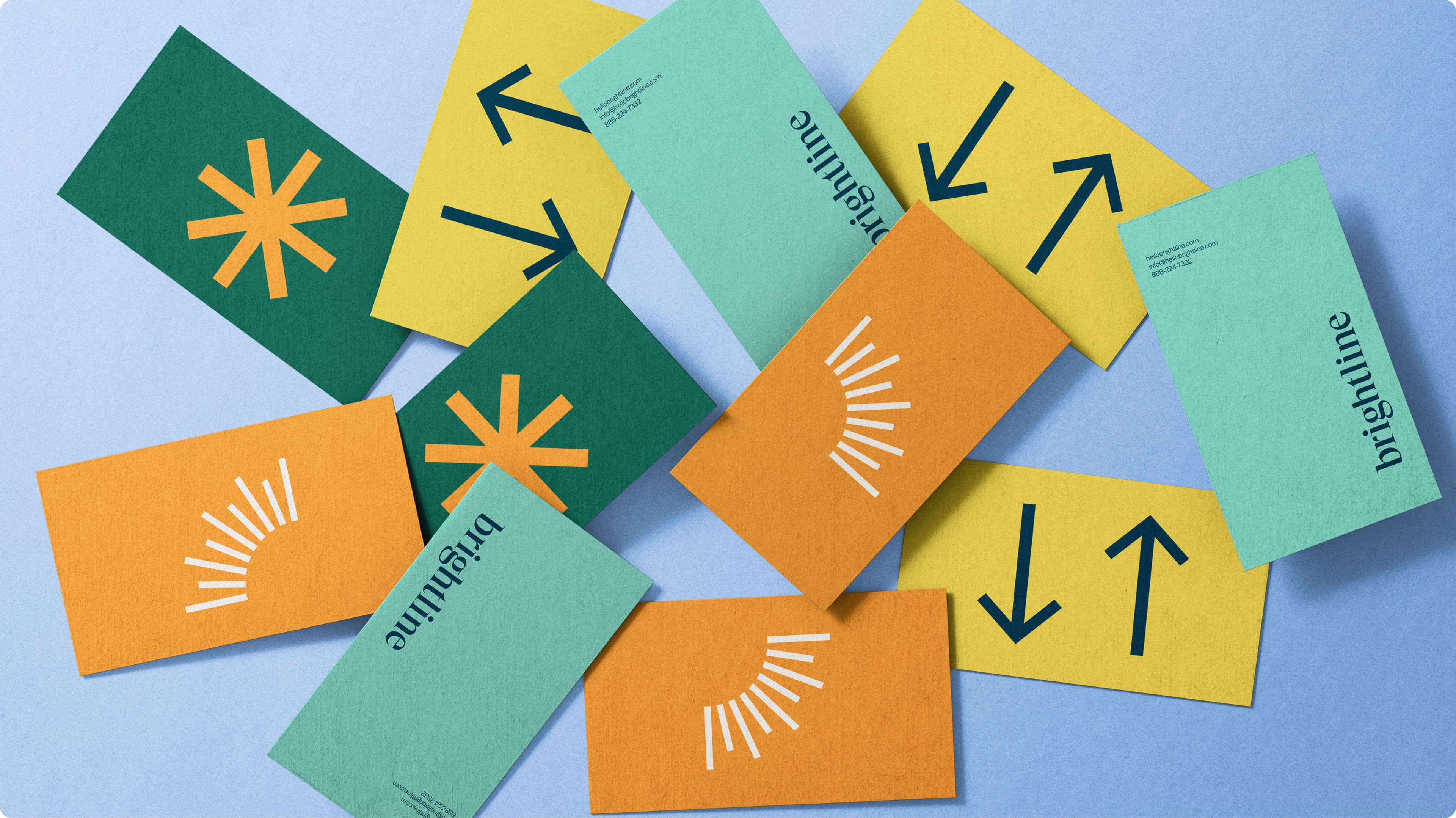
By refining existing elements alongside new ones, we ensured the brand remained instantly recognizable while maintaining an approachable and reassuring presence. Brightline’s existing logo lays as the foundation of their brand, tying together a stack of branding materials that fit effortlessly across various platforms.
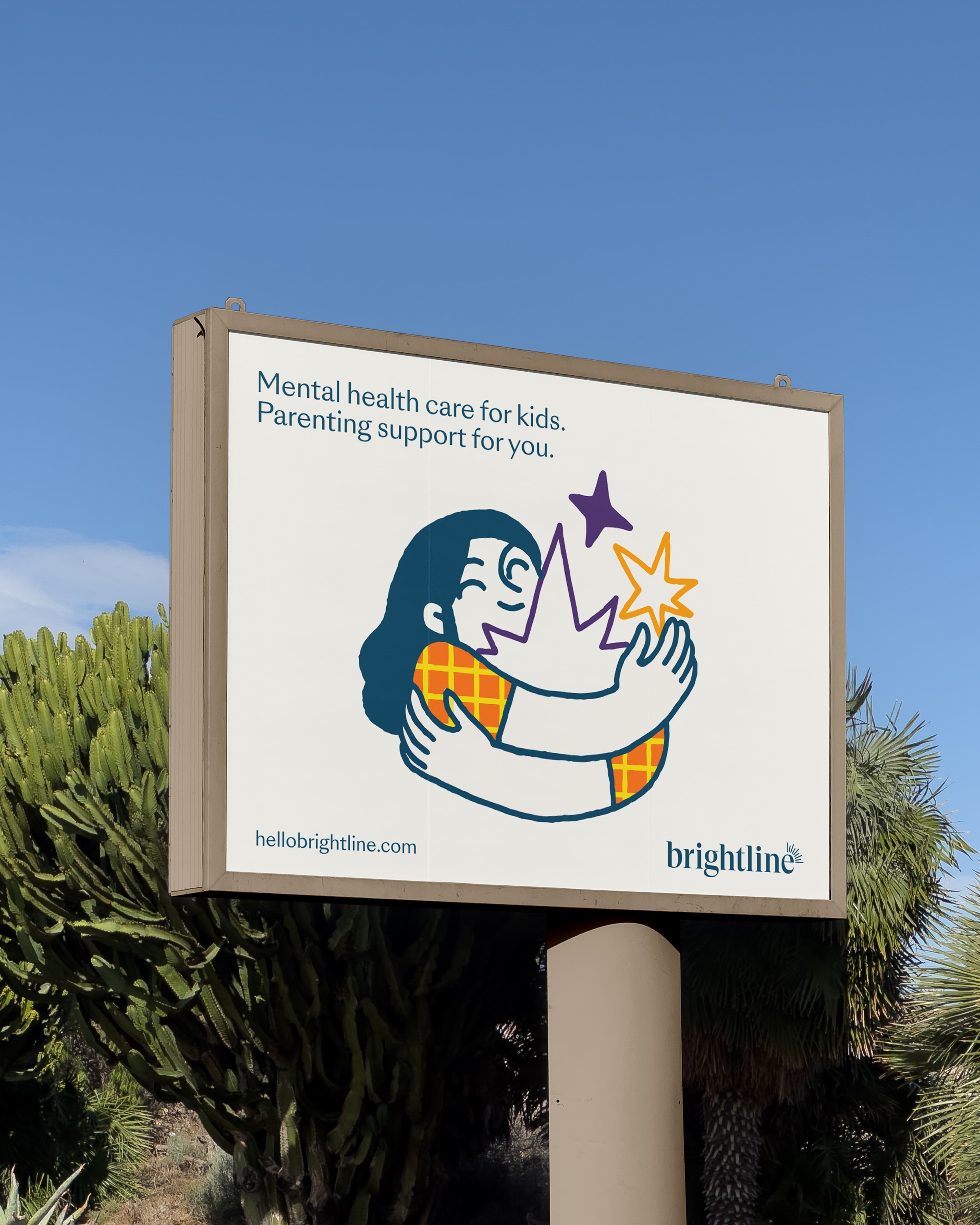
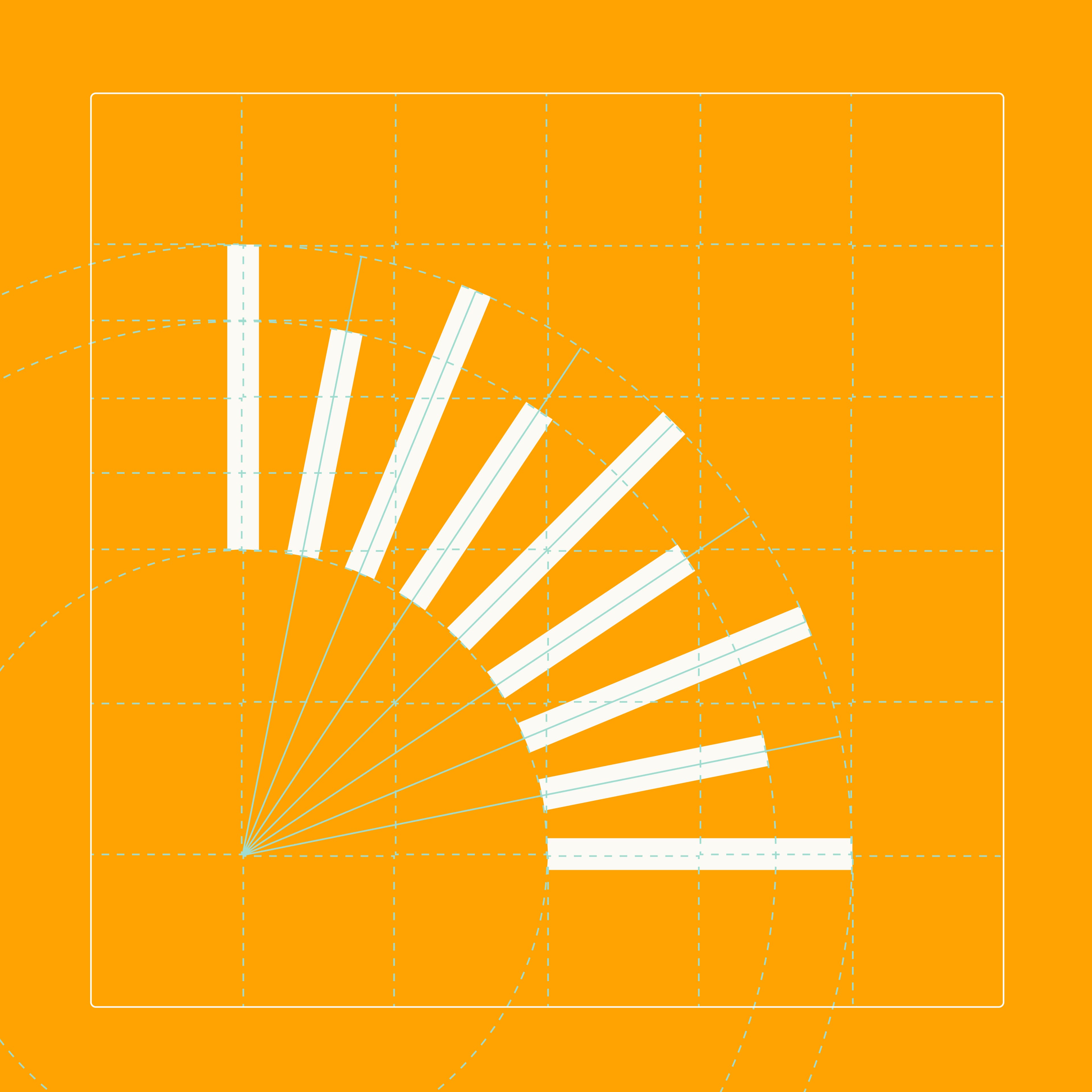
The mark, purposefully placed at the “e,” represents the light and positivity their organisation brings to families—symbolizing clarity, focus, and understanding in every interaction. Designed to be a flexible wordmark, we added custom detail to the serif typeface to add a sense of uniqueness to the logotype, simultaneously modernizing their brand for a new era of Brightline.
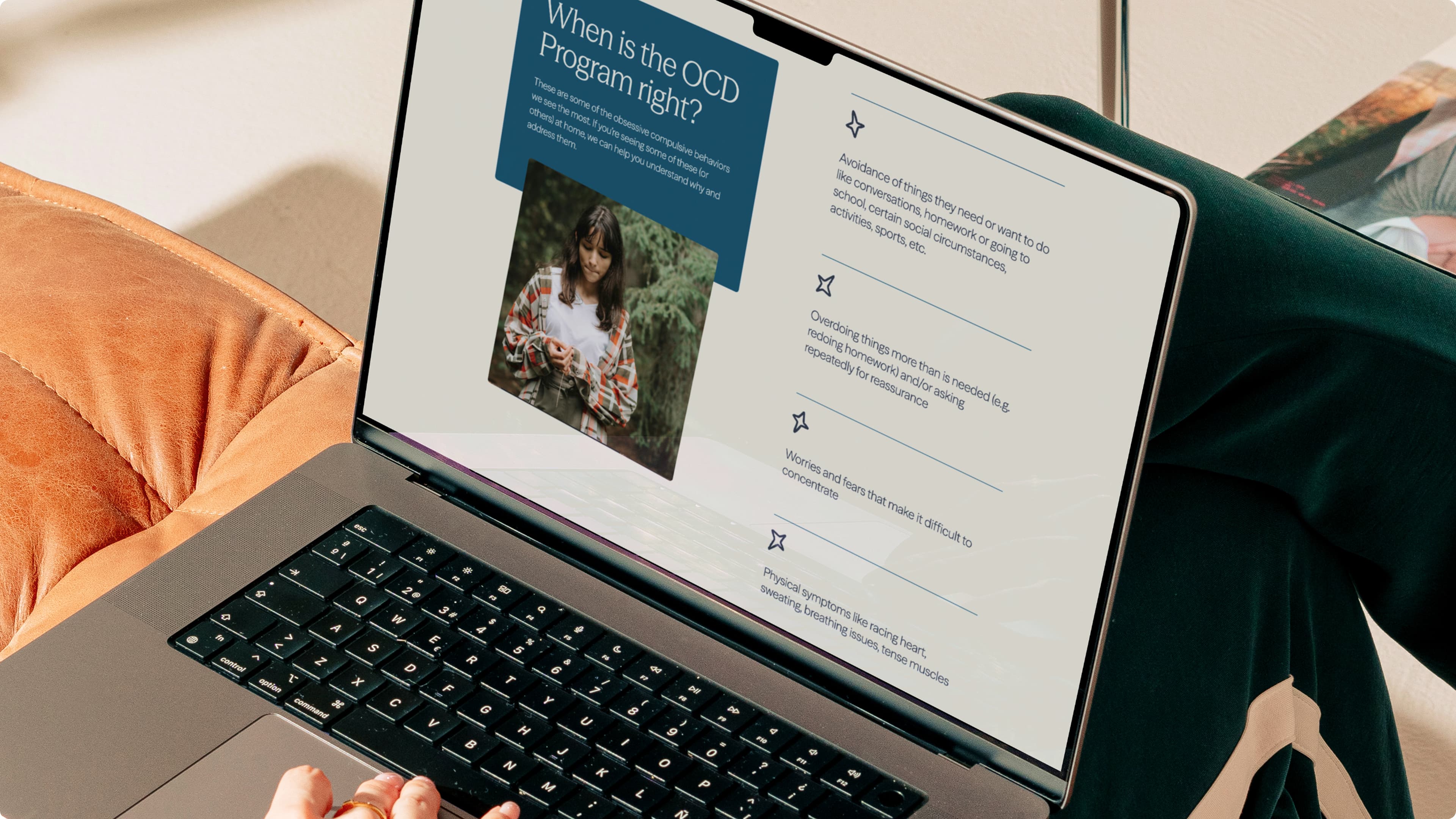
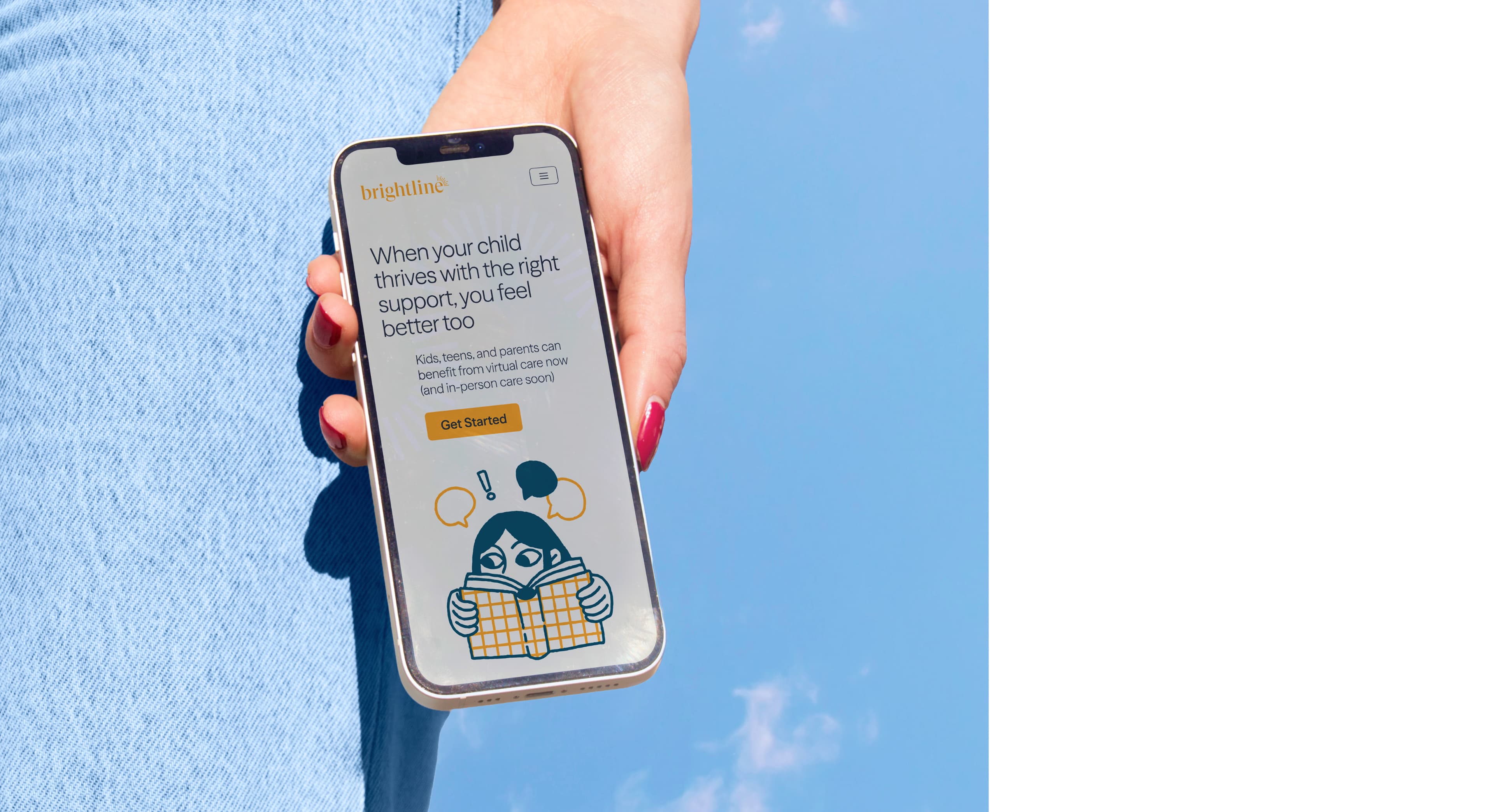
To revitalize Brightline’s web experience without disruption, we delivered a substantial front-end reskin and technical upgrade - rebuilding key pages with new components, imagery and custom animations, while keeping the site live throughout.. Built with the latest Next.js using server-side rendering (SSR), the site now supports extensive Lottie animations and delivers fast, largely static pages that feel light and intuitive for the user. We also introduced a dual-theme system to retain the original Brightlife Kids design alongside the new identity.
Every component was independently tested using Storybook, allowing for a clear validation of design and behaviour before integrating with the CMS - an approach that ensured a sharp fidelity across devices and states. Utilizing a headless Contentful CMS not only allowed us to deploy components in parallel with the existing live site, but also enabled all new content to be prepared and previewed without interfering with production. This made the final go-live as simple as an environment switch and publication, executed overnight for zero downtime.

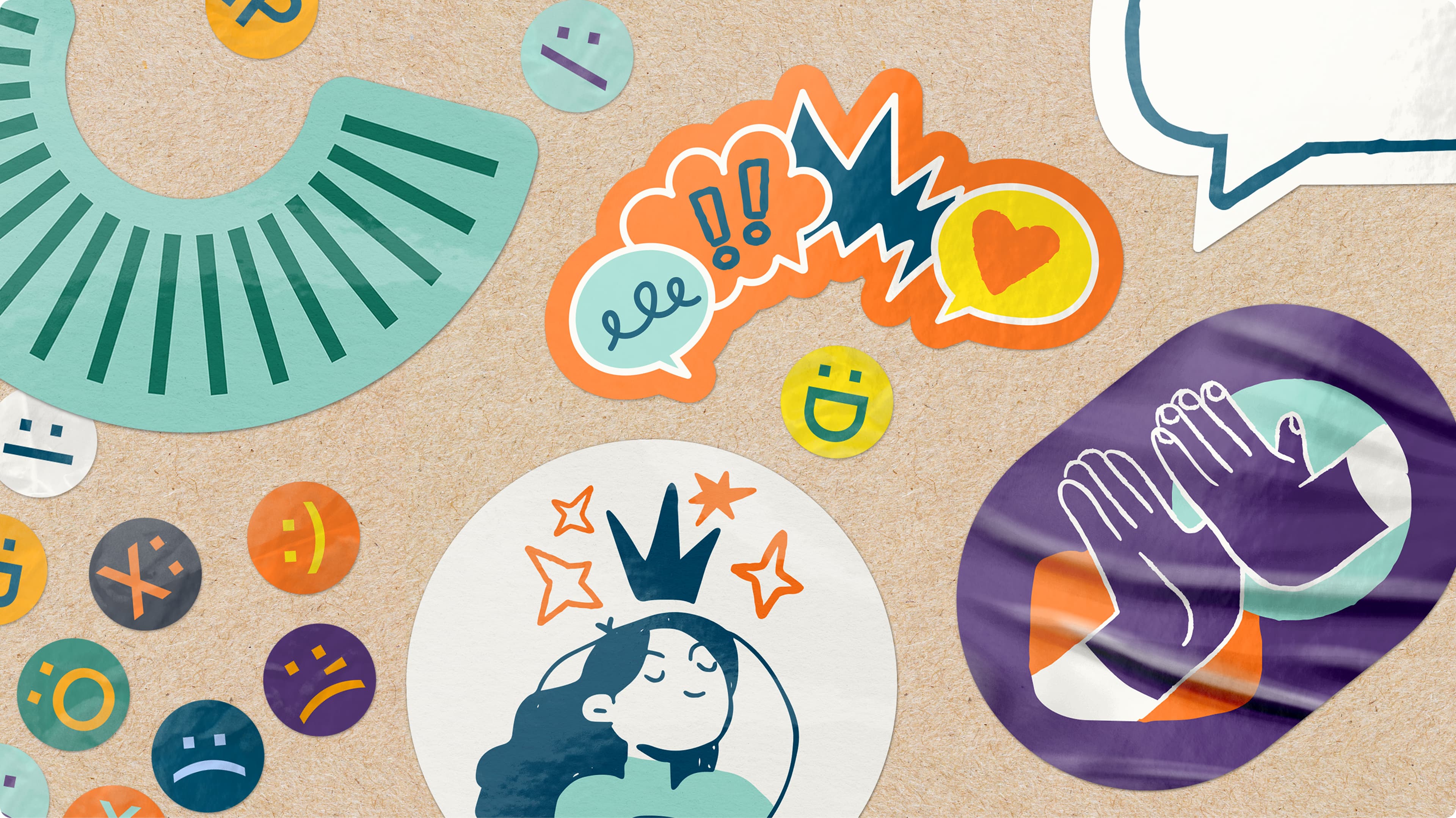
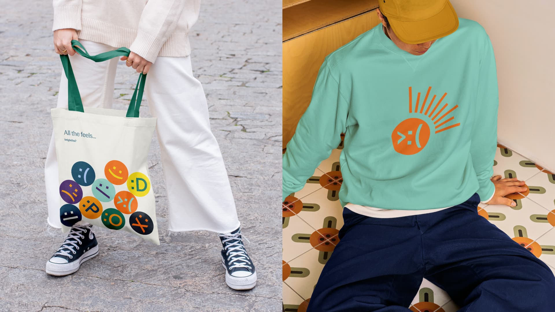
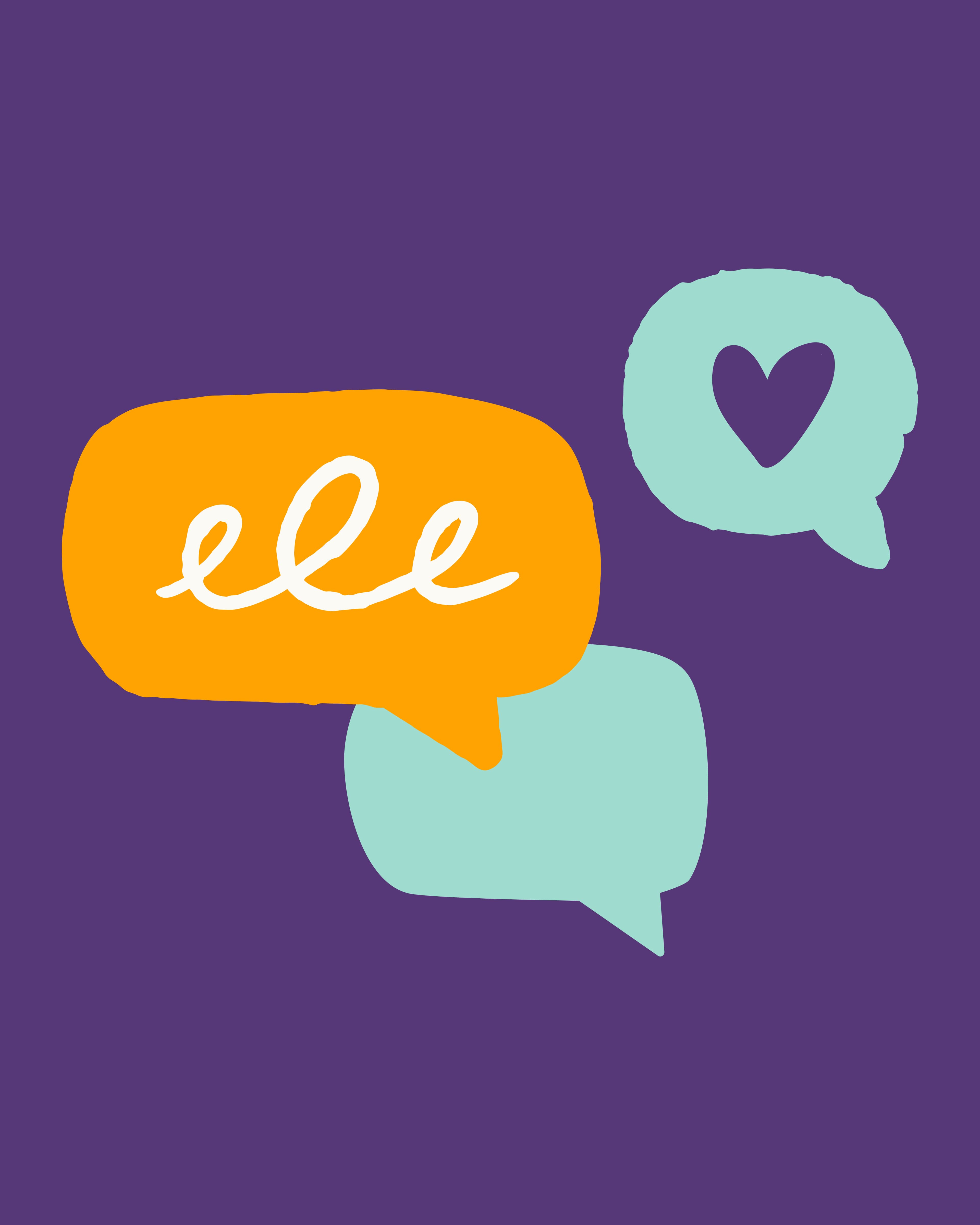
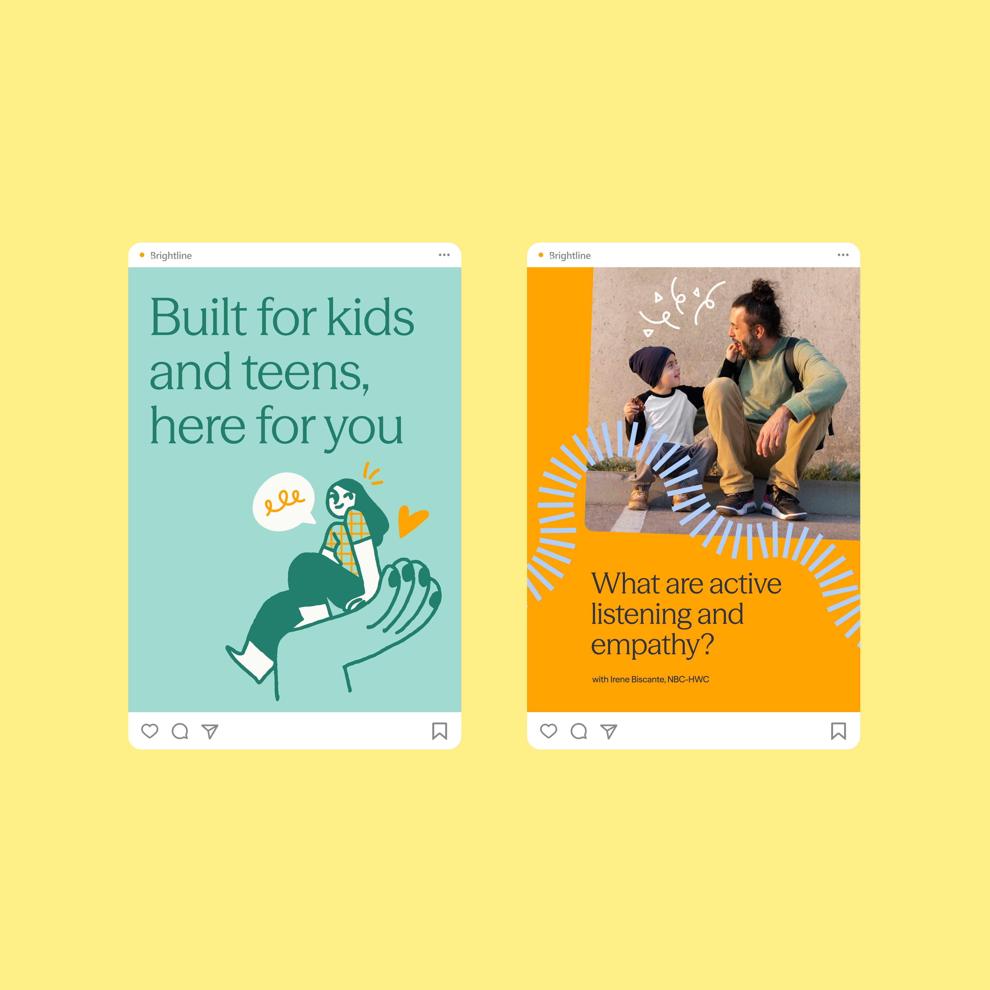
For a comprehensive design system, we introduced a set of illustrations and animations to inject warmth and personality into the brand. Their whimsical nature subtly features themes of mental health and well-being, creating a visual language that feels expressive, optimistic and inclusive. The distinct photographic style speaks of the full spectrum of real life. From happy, candid moments to more introspective scenes, the natural lighting and balanced tone help convey key brand attributes of accessibility and authenticity.
The renewed colour palette plays a central role in unifying Brightline’s visual language, setting a tone of calm confidence for all communications. All colour choices were designed to feel distinctive and deeply human, ensuring the brand consistently speaks with purpose across digital and print applications.
An extremely important part of this project was to follow the best practices for SEO and accessibility, including correct colour contrasts, keyboard navigation support, and compatibility with screen readers and voice-over tools - ensuring a performant, inclusive experience for all users.
Brightline’s renewed identity is a carefully defined digital and visual system that makes complex or sensitive topics feel approachable and engaging, reinforcing the provider’s commitment to mental well-being from a young age.